
Photographing food with iPhone
In this post I continue my mini-guide started HERE, which aims to provide some suggestions for photographing food with iPhone.
In the first part I told you about the light, the shadows and the background; what is their effect on the shot, how to organize them in the best possible way and in a simple way.
In this post, I will talk about the shooting angle and the colors.
SHOT ANGLE
Speaking of angles for photographic shots that want to shoot food, there are two approaches that can be used: the “brute force” approach and the “studied” one. Let’s get to know them better. The brute force approach means nothing more than taking shots of the plate or glass that you want to shoot from multiple directions and then decide only in post production what you prefer.
Is this an approach that works? Absolutely yes, and if you are in a hurry and do not want to delve too much into the dynamics behind it, that’s fine. The “studied” approach, as the word itself implies, involves a study of the subject and the rules (nothing transcendental for heaven’s sake).
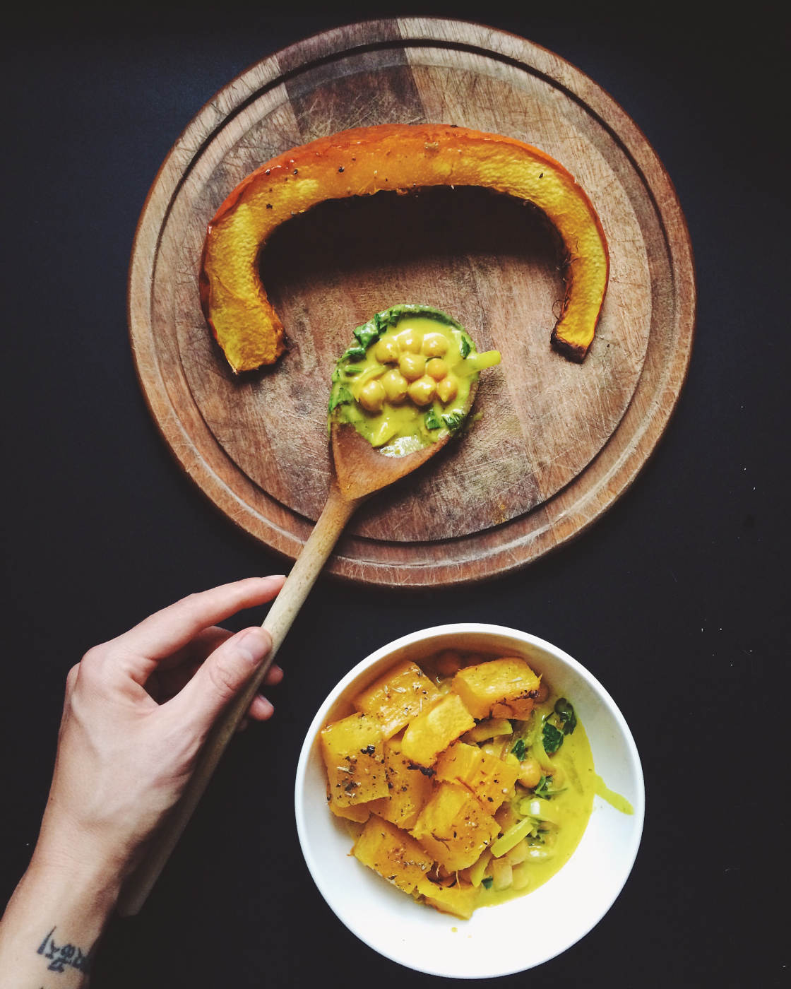
The basic rules are 2: if you are shooting a plate the best angle is that of the top, able to collect in the image all the components of the preparation as well as any tablecloths, cutlery and table that can be an excellent background at no cost .
If, on the other hand, you are shooting a glass, the front angle is preferred, which is able to better develop the image in height.
There are a few exceptions: for example, you could take a plate on the front if you want to highlight the colors of the porcelain. Just as sometimes (especially for cocktails) you may prefer to photograph one glass from the other to highlight the internal arrangement of accessories and additions such as ice, straw etc.
Beware of the light! The two rules above must “ALWAYS” be remodeled according to the available light and its direction.
COLORS
We discover hot water if we say that colors are a fundamental aspect of the dish. Even before photography, the study of colors in preparation is the subject of study in cooking schools. For example, if you happen to eat in a starred restaurant, you can be sure that the ingredients of every single dish that is proposed to you have been chosen not only on the basis of flavor but also on the basis of the chromatic harmony that the chef had in mind.
Also for what concerns the choice of colors there are two rules that I feel I can share with you; rather than rules we could see them as two “approaches”. There is the approach to color for “taste” and there is the approach to the color of food for “presentation”.
The approach to color by taste aims to highlight the taste of the dish itself. In this case, photography is only a humble servant of the more “gastronomic” sphere.
In the approach to taste, we tend to choose colors (and therefore ingredients) that are not far from each other or even better homo-chromatic. For example red with red, or red with orange and yellow. Brown with yellow.

The goal is our palate and not the eyes.
In the “presentation” approach, on the other hand, the goal is the eyes. The viewer must be amazed by the beauty of the photo and the subject even before his taste.
Let’s think, for example, of photographing a cup of ice cream.
With a similar subject we can create situations with bright colors and perhaps strongly contrasting or complementary to each other.
